
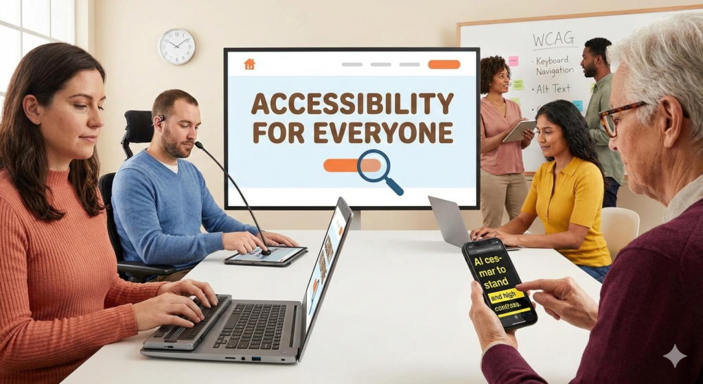
The internet was built on the foundation of universal access.
However, for over one billion people worldwide living with some form of disability, the digital world is often full of barriers. 🚫
Imagine trying to navigate a website without a mouse, or trying to read content that has poor color contrast. 🧐
This is the daily reality for many users when websites are not designed with inclusivity in mind.
accessibility testing is not just a technical checkbox; it is a moral imperative and a smart business strategy.
By ensuring your website is accessible, you are opening your doors to a wider audience, improving general user experience (UX), and mitigating legal risks. ⚖️
Let’s dive deep into the world of accessibility testing and ensure your digital presence is truly welcomed by everyone. 🌍
“The power of the Web is in its universality. Access by everyone regardless of disability is an essential aspect.” — Tim Berners-Lee, W3C Director and inventor of the World Wide Web
Understanding the Standards: What is WCAG?
To perform effective accessibility testing, you need a benchmark against which to measure your site.
The global standard is the Web Content Accessibility Guidelines, commonly known as WCAG. 📘
Developed by the World Wide Web Consortium (W3C), these guidelines provide technical specifications to make web content more accessible to people with disabilities.
WCAG is organized around four core principles, often remembered by the acronym POUR. 💡
If your website fails to meet any one of these principles, certain users will be unable to use it effectively.
| WCAG Principle (POUR) | What It Means for Users |
|---|---|
| Perceivable | Information and user interface components must be presentable to users in ways they can perceive (e.g., sight, sound, touch). It can’t be invisible to all of their senses. |
| Operable | User interface components and navigation must be operable. The interface cannot require interaction that a user cannot perform (e.g., mouse-only navigation). |
| Understandable | Information and the operation of user interface must be understandable. Users must be able to understand the information as well as how to use the interface. |
| Robust | Content must be robust enough that it can be interpreted reliably by a wide variety of user agents, including assistive technologies like screen readers. |
You can learn more about the specifics of these guidelines directly from the source by visiting the W3C’s Web Content Accessibility Guidelines Overview. 🔗
The Two Pillars of Testing: Automated vs. Manual
A common misconception is that you can simply run a software tool and instantly “fix” your website’s accessibility. 🤖
While technology is helpful, true accessibility requires human judgment.
Effective accessibility testing relies on a hybrid approach combining automated scans and manual reviews.
Automated Accessibility Testing
Automated testing involves using software tools to crawl your website and identify common accessibility violations against WCAG standards.
These tools are fantastic for quickly scanning hundreds of pages and catching low-hanging fruit. 🍎
They can easily identify missing alternative text on images, poor color contrast ratios, and missing form labels.
However, automated tools can typically only detect about 30% to 40% of accessibility issues.
They cannot determine if the alternative text actually describes the image accurately, or if the navigation flow makes logical sense to a human being.
Manual Accessibility Testing
Manual testing involves human evaluators reviewing the website to find issues that automated tools miss. 🧑💻
This is crucial because accessibility is ultimately about the human experience, not just code compliance.
Manual testing should ideally include testing with actual assistive technologies, such as screen readers (like NVDA or VoiceOver) and screen magnifiers.
It also involves reviewing the site using only a keyboard to ensure every interactive element is reachable and operable without a mouse. ⌨️
The gold standard of manual testing involves including people with disabilities in your testing process to get real-world feedback.
Critical Areas for Actionable Testing
Ready to start testing? 🚀
Here are the most critical areas you should focus on immediately to make a significant impact on your website’s accessibility.
- Keyboard Navigation: The “No Mouse” Challenge
Many users, including those with motor disabilities, rely entirely on a keyboard to navigate the web. To test this, put your mouse away. Can you tab through every link, button, and form field on your page in a logical order? Crucially, can you see a visible “focus indicator” (usually a ring around the element) that tells you where you are on the page? If you get stuck in a “keyboard trap” and can’t tab out of an element, that is a critical failure. - Alternative Text (Alt Text) for Images
Screen readers read the code behind a web page. When they encounter an image, they look for the alt attribute. If it’s missing, a screen reader might just say “image” or read the file name, which is useless to a blind user. 🖼️ Test your images to ensure they have concise, descriptive alt text that conveys the meaning of the image. If an image is purely decorative, it should have a null alt attribute (alt=””) so screen readers skip it entirely. - Color Contrast and Visual Presentation
For users with low vision or color blindness, sufficient color contrast between text and its background is essential. 🎨 Text that is too light against a light background (or dark against dark) is unreadable. WCAG has specific ratios you must meet (generally 4.5:1 for normal text). Don’t guess; use a tool like the WebAIM Color Contrast Checker to verify your color palette. - Headings and Semantic Structure
Sighted users scan pages quickly by looking at large headings. Screen reader users do the same thing using keyboard shortcuts to jump between headings (H1, H2, H3). 📑 Your headings must form a logical outline of the content, not just be used for visual sizing. Ensure you don’t skip heading levels (e.g., jumping from an H1 directly to an H3), as this confuses navigation for assistive technology. - Forms and Labels
Forms are often the biggest barriers on the web. Every form field (input, checkbox, dropdown) needs a programmatic label linked to it. Without a proper label, a screen reader user might land on an input field and have no idea what information is expected. 📝 Furthermore, ensure that error messages are clearly identified and easy to recover from.
“Accessible design is good design — it benefits people who don’t have disabilities as well as people who do. Accessibility is all about removing barriers and providing the benefits of technology for everyone.” — Steve Ballmer
Essential Tools for Your Accessibility Toolkit
While human testing is paramount, the right tools can significantly speed up the process and help you identify technical issues. 🛠️
Here are some highly recommended tools to get you started with accessibility testing.
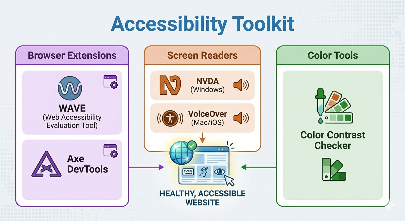
| Tool Name | Type & Best Use |
|---|---|
| WAVE (Web Accessibility Evaluation Tool) | A browser extension that injects icons right onto your page to highlight potential issues like missing alt text or contrast errors. Excellent for beginners and visual checking. |
| Axe DevTools | A powerful browser extension aimed more at developers. It provides detailed issue descriptions and guidance on how to fix them within the browser’s developer console. |
| NVDA (NonVisual Desktop Access) | A free, high-quality screen reader for Windows. It is essential for testing how your content sounds to blind users. |
| VoiceOver / TalkBack | Built-in screen readers for macOS/iOS and Android, respectively. Crucial for testing mobile accessibility. |
Using a tool like Axe by Deque Systems during the development phase can prevent many accessibility bugs from ever reaching the live site. 🛡️
It is much cheaper and easier to fix an issue while coding than to remediate it after launch.
Conclusion: The Business Case for Inclusion
Accessibility testing is not just about avoiding lawsuits, though the legal landscape regarding digital accessibility, including the ADA in the US, is becoming increasingly stringent (see Ada.gov guidance on web accessibility). ⚖️
It is about recognizing the massive, untapped market of people with disabilities.
When you design for accessibility, you almost always improve the user experience for everyone.
Clear navigation helps everyone find what they need faster.
Good color contrast makes your site readable out in the bright sun. ☀️
Captions on videos help people watch in quiet environments like libraries or offices.
Furthermore, accessible websites often perform better in search engine rankings (SEO), as Google’s bots rely on many of the same semantic structures that assistive technologies do. 📈
Commit to regular accessibility testing today.
Start small, use the tools available, and prioritize the most critical issues.
By making the digital world more inclusive, you build a better brand and a better web for all. 🤝